The header contains the European Commission logo, the title of the application, the logged-in user and the language selector.To change the language, the user can click on the displayed language and select the desired one in the menu. Two actions are available below the logged-in user: the possibility to log out from the application and the possibility to see the details of the user, i.e., its identifier, type of identifier, username, country, type of actor, role(s), acting identifier and delegation information. An explanation about the menu, which is at the bottom of the header, is given in Section 3.2.
3.4.2 Footer
Footer
The footer, which is present on each page, contains the following information:
Help: Via the “Help” link, the user manual of the application will be opened in the current language of the user, in a new window. If the translation of the user manual is not available in his language, the English user manual is opened by default.
About this site: The user is redirected to the "About this site" page of the European Commission website.
Legal Notice: The user is redirected to the "Legal notice" page of the European Commission website.
Version: The current version of the system is indicated.
3.4.3 Tooltips
Each field of the forms is prone to be described by a tooltip, which aims at guiding the user on "how to fill" the related field in. The user can display the content of the tooltip by clicking on the icon. The tooltip text remains visible until it is closed by clicking on the icon again or on the "X" on the right side of the tooltip.
Here below, an example of the new tooltip that appears when the user clicks on the tooltip button [1]. The tooltip [2] remains visible to help the user until he / she closes it by clicking on the tooltip button [1] again or on the cross [3].
Tooltips appearance
3.4.4 Validation of a form
When the user fills in a form, the system verifies that the data has been properly entered according to the given rules. The validation of a form is performed in two steps:
Syntactic validation, performed at client-side;
Semantic / business validation, performed at server-side.
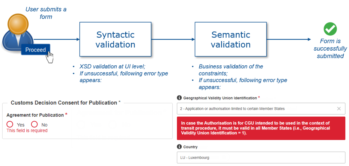
The process is depicted in the figure below. Once the syntactic validation is successful, the semantic / business validation is performed. If the latter is successful as well, the form is finally submitted.
Two-steps form validation
The aim of this section is to explain further these two validation types in order that the user understands the error message(s) shown to him / her and knows how to correct the form.
3.4.4.1 Syntactic validation
With the syntactic validation, the following is checked: the cardinality (mandatory or optional) and the format of a field. A field is validated while the user types and when the user clicks on the "Submit" button. Such validation is directly visible in the user interface, while the user completes a form.
3.4.4.1.1 Cardinality
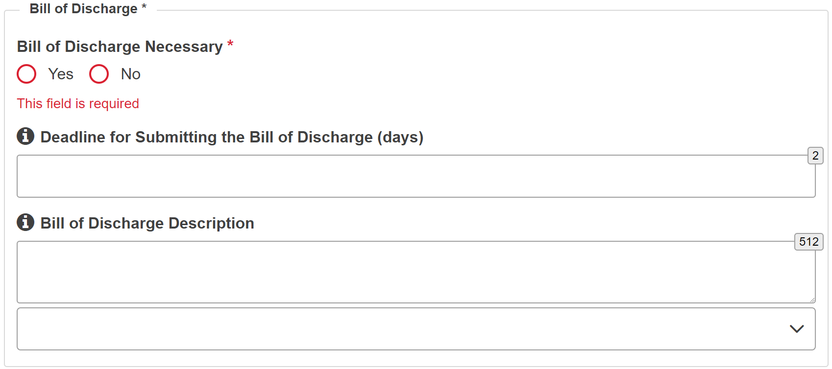
Mandatory fields: All fields marked with an asterisk are mandatory: a red asterisk * is used for data elements and a grey asterisk * is used for data groups, as shown on the screenshot below.
An asterisk placed on a data group means that there is at least one mandatory field in this data group. In the example below, "Commodity Code" is marked as mandatory because at least the field "TARIC Code" must be filled in. The other two fields, i.e., TARIC Additional Code and National Additional Code, must be filled in depending on the Customs Decision Type.
Mandatory data group appearance
If the user enters some data in a mandatory field and deletes it, the system will inform him / her that the field cannot be empty, as displayed in the figure below.
Error message for empty mandatory data element
Mandatory data groups are expanded by default and cannot be collapsed.
Optional fields: Optional data groups (completely optional or subject to rules) are displayed collapsed by default (except otherwise stated in a specific screen).
In case one data group is created, all the mandatory fields inside that data group must be provided (even if the data group itself is optional) to proceed with the validation.
Optional data group (Empty)
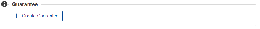
A message is displayed when the user hovers his / her mouse over the "Create" button in order to indicate its behaviour (i.e., “Create New Data Group”).
Expanded data group appearance
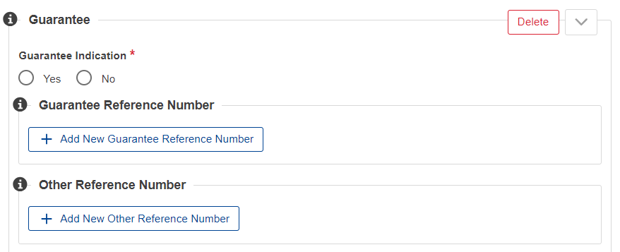
Once the data group has been created, it is possible to hide the considered data group or to delete it (for these 2 actions, 2 different buttons are foreseen):
Hide whilst keeping data inside the data group: In case the user clicks on the arrow button (v), the data elements entered will be hidden, but not deleted (upon processing of the page, the data should be saved).
Once collapsed the data group would be displayed as depicted in figure below.
Hidden data group
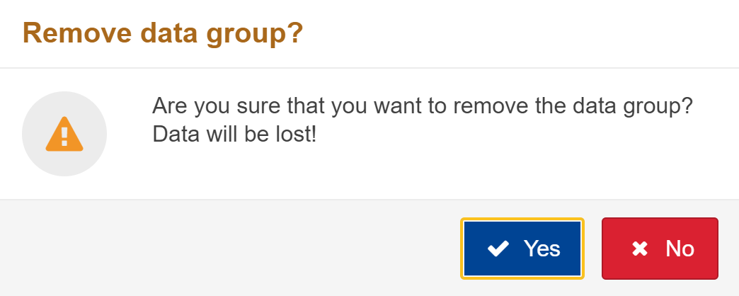
Delete the data group: In case the user clicks on the "Delete" button, the data elements entered will be deleted and the data group will be collapsed. Before proceeding with the removal of the data group, a warning message indicating that data is about to be deleted will be shown to the user. If the user proceeds with the warning, the data will be deleted and the data group will be collapsed.
Warning pop-up when deleting a data group
A message is also be displayed when the user hovers his / her mouse over the "Delete" button in order to indicate its behaviour (i.e. “Delete Data Group and all information inside”)..
3.4.4.1.2 Format
The format of a data element is checked in the user interface, e.g., the number of remaining characters that can be entered is displayed, the user is asked to enter the minimum number of characters when required, the user is prevented from entering a letter if a number is expected, etc.
3.4.4.2 Semantic validation
With the semantic validation, the business rules are checked (e.g. one field out of two must be filled out, but not both). A field is validated only when the user clicks on the "Submit" button. Hence, such validation is not directly visible while the user completes a form; he / she must submit the form in order to see the error message(s). In case a field is not correctly filled in according to the business rule(s), an error message in a red box appears under the data group or element, as depicted in the figure below.
Semantic validation - Error message upon form submission
For both validation types (syntactic and semantic validation), the browser will automatically scroll to the first displayed error and the tab(s) containing the error(s) will be highlighted. If another tab contains an error, the text of the header of the tab will be displayed in red. As soon as the error(s) are solved by the user, the red alert disappears.
Tab is highlighted as it contains error(s)
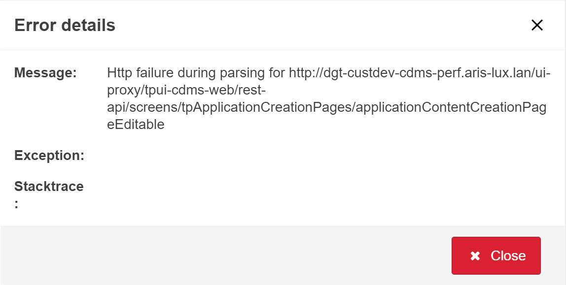
3.4.5 General Error Messages
In addition to the aforementioned types of errors, general system error(s) may occur. The description of the error message is displayed on the top of the page.
Example of Error Message - General error message
General messages are received mainly for the following contexts:
Role restrictions violation;
Violations of any system rules.
3.4.6 Number Formatting
Numbers are displayed 3 digits by 3 digits with a space in-between in view mode. A pattern is applied in edit mode to enforce that numbers are entered 3 digits per 3 digits. Moreover, the decimal separator to use is the comma (common decimal separator in most of the European countries). This separator is enforced in edit mode.
3.4.7 In Progress Status
In case an operation requires a noticeable time, an animation indicates that the operation is in progress.
3.4.8 Warning and Information Messages
When relevant, a warning is displayed in order to notify the user about important matters, at the top of the screen, just above the title page. Note that the warning text is translated. The figure below displays such warning message.
Example of a warning message
When relevant, an information box is displayed in order to provide some additional clarifications to the user, at the top of the screen, just above the title page. Note that the information text is translated. The figure below displays such information message.
Example of a information message
3.4.9 Session Timeout Warnings
The user will be warned by a pop-up dialogue when approaching the session timeout which will result in an automatic logout. It is hence possible to choose to either extend the session or to log out. Not reacting to that dialogue will result in the user logout after a configurable time.
Session Timeout Warning
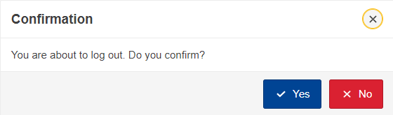
3.4.10 Confirmation Modals
After certain important performed actions, a confirmation modal might pop-up to the user asking for his / her confirmation. This confirmation modal aims at preventing the user from making errors. An example of modal confirmation is provided in the figure below.
Confirmation modals - example
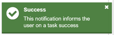
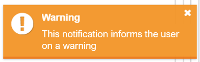
3.4.11 Notifications on Performed Action
Anytime an action is performed by a user, a notification on the performed action may be displayed to the user in order to inform him / her on the success of the action and / or on the general information related to that action. The actions for which notifications are displayed are submitting a task and saving a form for later use. The notifications are displayed at the top right of the user’s screen and their aspect depends on the notification type. There are four cases:
The notification informs the user on the success of a task;
Success notification - example
The notification informs the user on general information (e.g., possible next task(s));
Information notification - example
The notification informs the user on a warning;
Warning notification - example
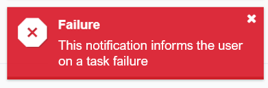
The notification informs the user on a task failure;
Failure notification - example


 icon. The tooltip text remains visible until it is closed by clicking on the